
Visualizing geologic information: Graphing and charting geologic data using Deltagraph Pro
Visualizing geologic information is an essential step in developing
understanding about the relationships between different asp data and model
results.
It is worth considering how your data or results are presented. This is what
advertising all about. You must be aware of the effect of presentation on
the viewer.
Visualizing information
The practive of visualization has many aspects. For today's lecture, I want
to bring to your attention the work of Edward Tufte, a professor at Yale
University who has written several books on the visual presentation of
information:
"Show data variation, not design variation."
The Visual
Display of Quantitative Information
Envisioning
Information
Visual
Explanations
One of the concepts from Tufte that has influenced me grately is the
data/ink ratio. You want to have as much of the ink in your graphic
dedicated to the most important data, rather than any design for a plot or
graphic.
Chart ducks
One example of the data/ink ratio is that of chart ducks. Many charting
programs try to help by prviding design tools that actually are not very
helpful. For example, below is a pie chart that shows the distribution of
clast types in a Quaternary deposit in the western White Tank Mountains,
Arizona:
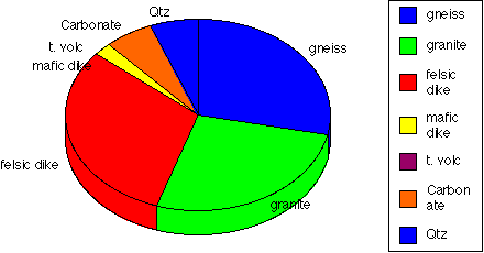
Note that the 3D effect looks kind of cool, but it is also distracting.
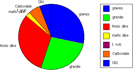
What about this one:
Graphing and charting geologic data using Deltagraph Pro
While Microsoft Excel has adequate charting capabilities, there are some
plotting tasks that it does not do or not very well. Another program that
we have found to be useful is called Deltagraph Pro.
This program has two main parts: a data section and then a chart
section.
On the Macintosh side of the computers, start up Deltagraph Pro.
Note that it comes up into a page called Untitled#1:Dataview. This page
is one inwhich you can put some data to be plotted.
Sediment provenance example
Here are some data from a count of the number of clasts of a given type
within a square meter on the piedmont of the White Tank Mountains (what we
used in the pie charts above).
CLAST TYPE	O surface	M1b surface
gneiss            39	        43
granites	37	        41
felsic dikes	43	        46
mafic dikes	3	         1
T. volcs	0	        23
soil carbonates	8	         0
vein quartz	8	        14
Copy those data and then paste them into the dataview page in Deltagraph.
Place the cursor in the upper left corner of the page so that the labels
are in the labels positions for the columns and rows.
BUT, you will note that it does not put things automatically into the
proper columns! How annoying. However, you have things there, so it is
easier in this case to fix the data by cutting and pasting into separate
columns. Make sure that the upper label row has labels in it so that you
can get the autolabeling capability to work. Note that you can import
excel files so this cutting and pasting business is not necessary.
Let's do some plotting.
1) Click the cursor in the little arrow in the upper
left corner of the Dataview window. That will select the data so that it
can be plotted correctly.
2) Click in the Data menu and select Chart Gallery. Note that you will
have many to choose from. You can limit your choices by turning the
different types on and off.
3) Choose pies and then choose choose multiple pies and click ok. You
will get a chart view window with your chart in it. You can resize the
chart by grabbing the handles (the little black boxes on the sides that
appear when the plot is selected). You can also add annotation and
graphics by choosing the correct tool from the tool palette on the left.
4) Go back to the dataview by clicking on the view menu and then data and
page 1. Note that you can name these pages and plots under this menu, as
well as delete or add pages. If you are plotting lots of related data, you
might have several different data pages.
5) Select your data again and then chart gallery and try a different type,
such as bars and then columns.
6) We want to label this plot a bit, so select it, and then under the
chart menu, choose labels->Y and then give the Y axis a label. In this
case, it is Number of occurences.
7) Try a few more plots. Note that you can navigate among the charts under
the view menu.
8) you can export the plots as pict files which might be useful for some
drawing programs, or you can select the plot, and go to Microsoft Word
(running at the same tome on the Macintosh), and paste the graphic. Why
don't you try it?
Topographic mapping example
I got started with Deltagraph because I found that it handled topographic
mapping quite well. We have used the program Deltagraph Pro to contour our
data. This program has two advantages: 1) it can contour a set of data
with an irregular boundary, enclosing the area of interest with a
relatively close fitting polygon, instead of a rectangle, as is common with
most contouring programs; and 2) it uses triangle-based terrain modeling
(commonly called a Triangular Irregular Network--TIN). This
method essentially models the surface as a series of planar, triangular
elements, each of which contains three neighboring data points. The points
where contour lines intersect the
lines between neighboring points are determined by direct, linear
interpolation. The contour lines are then determined by connecting those
intersections. Because the contour lines are not smoothed, this method
provides a basic contour map that honors each data point directly.
We will
use an example of some data that were surveyed byt the ASU Geomorphology
course that I taught last fall. We ma
pped the topography over a terrace riser adjacent to Queen Creek by
measuring the Easting, Northing, and Elevation locations of a few hundred
points in the landscape with a surveying instrument.
1) Connect up to the public folder on Caliente, PSF640 in the Appleshare
PSF zone as guest. You will see a file there called and double-click on the
file named QueenCreek.txt. That is a file of data that is the point
number, Easting coordinate, Northing coordinate, and Elevation all
separated by a tab that I exported (under Save as...) from Excel.
2) Launch DeltaGraph Pro if it is not already running. Under file menu,
choose new. Then click on Import under the file menu, choose
tab-delimited data, and then find the QueenCreek.txt file and import it.
3) Note that the data are imported into your dataview in Deltagraph with
the point numbers in the A column. Start by labeling the columns
appropriately.
4) We need to have the point numbers in the labels column so that they can
be plotted appropriately. Select columns A-D by clicking on the letters A
through D at the top of the columns. Then choose Cut under the edit
menu. Move the cursor to the upper left most cell in the labels row and
column and paste. Now the labels should be still correct in their rows,
but the point numbers will be in the labels column.
5) Click the cursor in the little arrow in the upper
left corner of the Dataview window. That will select the data so that it
can be plotted correctly.
6) Click in the Data menu and select Chart Gallery. Note that you will
have many to choose from. You can limit your choices by turning the
different types on and off. MAKE SURE TO USE THE 2D PLOTS. The 3D will
let you make a cool view of the site, but it is not what you want.
This time display contours and choose XYZ
countours. DO NOT USE the regular contours plot. It will not work very
well. You can see which is which by moving the mouse over the icon
without clicking, and you will see the name of the plot type displayed
below in the Chart Gallery dialogue box. The push ok, and wait for the
contour plot to show up!
7) Click on the plot and then go to the Chart menu and add the appropriate
labels for the axes, change the label interval, etc.
8) Very importantly, the horizontal scales should be the same. Note that
Deltagraph Pro makes the plot square by default, but the map is actually
not. Make a note of the number of meters in the Easting direction and in
the Northing direction. Go to the Chart menu and choose Set All... Then
Choose Xaxis. Note that you can change the axis label intervals and so
on. Click on axis attributes and choose an appropriate scaling (such as 1
cm = 10 m) for the length of the axis. Do the same for the y axis. If
you want to change the contour interval, select the z axis and change the
interval.
9) To show symbols, click on the chart, go to options under the chart menu, and then select
show symbols. If the points are too big (data/ink ratio a bit low), under
the chart menu, choose symbols, and pick a smaller symbol as well as
smaller font size. To show the point numbers (the symbols have to be shown
first), choose Show values under the chart menu and then choose the
orientation of the point label, as well as category for the type. That
will display the point number. If you want to show the spot elevations,
then choose value instead of category.
Pages maintained by
Prof. Ramón Arrowsmith
Pages last modified on Tues Oct 7 1997.