
Formatting notebooks, evaluating equations, and plotting in Mathematica
From last time
George's efforts
Lecture notes prepared by George Hilley
Lab notes prepared by George Hilley
Mathematica 3.0 Palettes
Under the File? menu, look for a way to get these puppies opened up.
Formatting notebooks
Remember that Mathematica notebooks are made up of cells. The cells can
have different formats such as Input or Output, or text, or Title, or
sections. THe power of this formattting capability is that you can use it
as a notebook in which you make notes to yourself or someone else, and
guide them through a series of calculations and plots.
The way to proceed is to select a cell, and then under the menus
Style->Cell Style, choose the formatting. I usually start off with Title,
and then sections and subsections. Note that you can double click on the
edge of a section or subsection, you can expand or hide the section to
keep your notebook more compact.
You can bring graphics in by copying and pasting. It seems to work best
with gifs...
Plotting and simple graphics
Plot
Use this command to plot a function (I got these by typing two question
marks in front of the function name):
Plot[f, {x, xmin, xmax}] generates a plot of f as a function
   of x from xmin to xmax. Plot[{f1, f2, ...}, {x, xmin,
   xmax}] plots several functions fi.


Attributes[Plot] = {HoldAll, Protected}


Options[Plot] =
  {AspectRatio -> GoldenRatio^(-1), Axes -> Automatic,
   AxesLabel -> None, AxesOrigin -> Automatic,
   AxesStyle -> Automatic, Background -> Automatic,
   ColorOutput -> Automatic, Compiled -> True,
   DefaultColor -> Automatic, Epilog -> {}, Frame -> False,
   FrameLabel -> None, FrameStyle -> Automatic,
   FrameTicks -> Automatic, GridLines -> None,
   MaxBend -> 10., PlotDivision -> 20., PlotLabel -> None,
   PlotPoints -> 25, PlotRange -> Automatic,
   PlotRegion -> Automatic, PlotStyle -> Automatic,
   Prolog -> {}, RotateLabel -> True, Ticks -> Automatic,
   DefaultFont :> $DefaultFont,
   DisplayFunction :> $DisplayFunction}
Try this:
Plot[Cos[x], {x, 0, 2 Pi}]
How about some color?
Plot[Cos[x], {x, 0, 2 Pi}, PlotStyle->RGBColor[1,0,0]]
Axis labels?
Plot[Cos[x], {x, 0, 2 Pi}, PlotStyle->{RGBColor[1,0,0]}, AxesLabel->{"x", "Cos[x]"}]
ListPlot
What if you have some data that you want to plot, rather than a
function?
ListPlot[{y1, y2, ...}] plots a list of values. The x
   coordinates for each point are taken to be 1, 2, ....
   ListPlot[{{x1, y1}, {x2, y2}, ...}] plots a list of values
   with specified x and y coordinates.


Attributes[ListPlot] = {Protected}


Options[ListPlot] =
  {AspectRatio -> GoldenRatio^(-1), Axes -> Automatic,
   AxesLabel -> None, AxesOrigin -> Automatic,
   AxesStyle -> Automatic, Background -> Automatic,
   ColorOutput -> Automatic, DefaultColor -> Automatic,
   Epilog -> {}, Frame -> False, FrameLabel -> None,
   FrameStyle -> Automatic, FrameTicks -> Automatic,
   GridLines -> None, PlotJoined -> False,
   PlotLabel -> None, PlotRange -> Automatic,
   PlotRegion -> Automatic, PlotStyle -> Automatic,
   Prolog -> {}, RotateLabel -> True, Ticks -> Automatic,
   DefaultFont :> $DefaultFont,
   DisplayFunction :> $DisplayFunction}
First we should define a list of values:
data = {

{19.75, 1490},

{407, 10510},

{545, 11160},

{825, 11730},

{1158, 12410},

{1454, 12585},

{2060, 13445},

{2263, 14685}

}
Basically, that defines a list of lists, where the inner lists are the
pairs of data.
ListPlot[data]
Then, use some of the same options as above.
Basic graphics
How about some graphics primitives?
If youwant to draw a line, use this:
Line[{pt1, pt2, ...}] is a graphics primitive which
   represents a line joining a sequence of points.
Line[{{x1, y1}, {x2, y2}}]
But, that is not quite enough. You have to make that into a graphic by
wrapping it in graphic:
Graphic[Line[{{x1, y1}, {x2, y2}}]].
Then, to display it, you need to use the command Show:
Show[Graphic[Line[{{x1, y1}, {x2, y2}}]]]
also:
Circle[{x, y}, r] is a two-dimensional graphics primitive
   that represents a circle of radius r centered at the point
   {x, y}. Circle[{x, y}, {rx, ry}] yields an ellipse with
   semi-axes rx and ry. Circle[{x, y}, r, {theta1, theta2}]
   represents a circular arc.
Text[expr, coords] is a graphics primitive that represents
   text corresponding to the printed form of expr, centered
   at the point specified by coords.
Point[coords] is a graphics primitive that represents a
   point.
Let's combine graphics and do a tidbit of geology
This comes from the book Mathematics: a simple tool for
geologists, by David Waltham, Chapman and Hall, 1995.
Because of the cooling of oceanic crust and its loss of boyancy, as well as
sediment loading, water depth, d, in the vicinity of a mid-ocean spreading ridge
depends on the square root of the distance, x, from the ridge axis
according to:
d = d0 + a x ^(1/2)
where d0 is the depth of the ridge axis, and a is a constant that depends
on factors such as the spreading rate.
Let's make a function so that we can make things a bit easier:
d[d0_, a_, x_] := d0 + a x ^(1/2)
Now let's plot it for an example of the Pacific-Antarctic spreading ridge
assuming d0 = 2.3 km, and a = 0.08.
What would you do?
Add axes labels, etc.
Now here are some data to plot:
distance, depth
0, 2.3
300, 3.6
600, 4.4
900, 4.8
What would you do?
Assign those plots to variables by puting the variable name = in front of
the command:
myPlot = ListPlot[data]
Then use show and put both plot variable names together:
Show[myPlot, myPlot1];
Now you can put a bit of explanation by putting a point and the
explanation, Average water depths, on your plot.
What would you do?
Evaluating equations
I have found that if I am reading a scientific paper, I will often do so
with Mathematica by my side so that I can build a notebook that helps me
to experiment with the equations and ideas that come up in the paper.
This is best done by writing yourself a notebook that includes functions
and plots that illustrate or mimic the analysis from the paper. let's try
it:
A simple model for earthquake displacements
We will make a notebook to develop the tools for determining displacements
due to slip along a patch in a half-plane. The technique is based upon the
formulation of Yijun Du (Du, Y., Segall, P., and Gao, H., 1994,
Dislocations in inhomogeneous media via a moduli-perturbation approach:
general formulation and 2-D solutions, 99, 13,767-13,779, Journal of Geophysical
Research, Appendix D).
Assume a two-dimensional model of a dip-slip fault:
Geometry: Arbitrarily dipping fault in a half-space; the fault is
infinitely long.
Material properties: Linear, elastic, homogeneous.
Bounday conditions: Uniform slip on the fault. Stress goes to zero at
infinity.
Here is the problem set up:
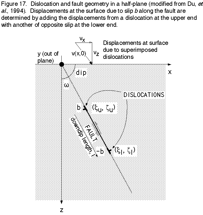
The method uses the simple solution of the elastic boundary value problem
for surface displacements due to a displacement discontinuity (fault slip) along an
edge dislocation in a half plane (means that it has a free surface and the
fault is infinite in and out of the plane).
These are from Yijun Du:
Now, we start with the equations. Here are the variables (see also figure
1):
b is burger's vector (fault slip)
x is horizontal (positive to the right; parallel with the free surface)
z is the vertical direction (positive downward)
(greek x, greek z) is coordinate of upper end of dislocation
w is angle of dislocation with respect to the x axis (complement of the dip
angle)
l is the downdip extent of the fault
(*Definition of components of Burger's vector, b:

bz = b Cos[w];

bx = b Sin[w];*)
This is the function that determines the location of the dislocation relative
to the point of interest (x, 0):

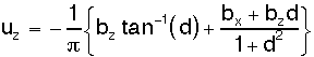
Here is the equation for the vertical component of the surface
displacements as a function of x (Vertical displacements, single dislocation, up is negative):
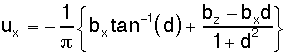
And the horizontal component (Horizontal Displacements, right is positive):
A fault is simulated by using two dislocations at each end of the fault,
with the lower one having the opposite sign of burger's vector. Given l,
the down dip extent from the upper disloc at (xu, zu), we can determine
(xl, zl), the coordinate of the lower disloc in the following way: (xl, zl)
= (xu + lx, zu + lz), where lx = l sin w, and lz = l cos w. We have
thrusting with a positive b and w > 0, or dip < 90.
Don't forget that we want to not have to think of things in terms of w,
so let's convert w to dip: w = 90 - dip or w = Pi/2 - dip.
But first, we need a way to convert from degrees to radians:
rads[deg_] := deg (Pi/180)
For the vertical displacements, we should multiply by minus 1 so that
positive vertical displacements are uplift.
Once you have plotted the components of the displacement field separately,
try to do it as vectors using the mathematica function Arrow.
To get that function, we need to use this command:
Needs["Graphics`PlotField`"].
Then try:
??Arrow, and you should get:
Arrow[start, finish, (opts)] is a graphics primitive representing an arrow starting
at start and ending at finish.


Options[Arrow] = {HeadScaling -> Automatic, HeadLength -> Automatic, HeadCenter -> 1, HeadWidth -> 0.5,
   HeadShape -> Automatic, ZeroShape -> Automatic}
Getting graphics out of Mathematica
You can of course, print.
But you might want to take the graphics into Canvas and spiff them
up...
To import the plot to Canvas for drafting, enlarge the plot to about 20"
wide (use the view scale at the bottom of the Mathematica window to go to
50%). Under the Cell menu, select Convert to PICT... When it is done,
copy the output, move to Canvas that you already have running with about
lots of RAM allotment for memory, and paste (you might try paste Picture
object under edit special). The graphic will be quite large, so
immediately select 'Group' under the Canvas Object menu. Then, select
Scale... under the Object menu also, and scale both vertically and
horizontally by 25%. You will have a graphic now that is 5" wide. I like
to immediately change all line weights to .25 and all text to Helvetica
before ungrouping. The reason that you have to do this is that Canvas
copies at 72 dpi, so if you paste with out enlarging, things will be very
jagged. If you enlarge, paste, and then reduce to 25%, you are effectively
getting 288 (4x72) dpi resolution, and that is adequate...
Pages maintained by
Prof. Ramón Arrowsmith
Last modified December 5, 1997