|
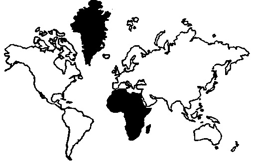
In the Mercator projection (c. 1569), Greenland, which has 0.8 million square miles, is shown as being equal to Africa, which has 11.6 million square miles.
A good discussion of this can be found at the Diversophy site, including the following execerpt:
"The Mercator projection creates increasing distortions of size as you move away from the equator. As you get closer to the poles the distortion becomes severe. Cartographers refer to the inability to compare size on a Mercator projection as "the Greenland Problem." Greenland appears to be the same size as Africa, yet Africa's land mass is actually fourteen times larger (see figure below right). Because the Mercator distorts size so much at the poles it is common to crop Antarctica off the map. This practice results in the Northern Hemisphere appearing much larger than it really is. Typically, the cropping technique results in a map showing the equator about 60% of the way down the map, diminishing the size and importance of the developing countries.
This was convenient, psychologically and practically, through the eras of colonial domination when most of the world powers were European. It suited them to maintain an image of the world with Europe at the center and looking much larger than it really was. Was this conscious or deliberate? Probably not, as most map users probably never realized the Eurocentric bias inherent in their world view. When there are so many other projections to chose from, why is it that today the Mercator projection is still such a widely recognized image used to represent the globe? The answer may be simply convention or habit. The inertia of habit is a powerful force.
A different type of projection is an "Equal-Area" projection. This shows sizes in proportion while sacrificing true shape. The Peters Projection is one type of equal area map. Is it the only one? No, there are hundreds of others, but only a handful of others are in common use. The Mollweide projection, developed in 1805, is commonly used for displaying distributions (people, telecommunications equipment, the world's religions, etc). Karl B. Mollweide (1774-1825) specifically sought to improve upon the weaknesses of the Mercator projection. The Eckert IV is another equal area projection developed in the 1920's by Max Eckert (1868-1938). This has the advantage of less shape distortion near the equator and the poles. A fourth equal-area map is Goode's Homolosine created in 1921 by J. Paul Goode (1862-1932). This interrupted map looks like an orange peel and has less shape distortion than the other equal area maps"
|
|