|
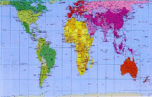
If anyone saw the episode of the television program "West Wing" where they talked about maps, it was the Peters map they were discussing.
The Peters Map of the World (1974) shows the earth's geographic relationships better than the standard Mercator map (c. 1569), which is what we all likely grew up with. In this map, land masses and nations are shown in true proportion. For example, the sheer physical enormity of Africa is clear. The traditional Mercator map seriously distorts physical geography, vastly over-representing the northern hemisphere and under-representing the southern hemisphere. In the Mercator projection, as another example, Greenland, which has 0.8 million square miles, is shown as being equal to Africa, which has 11.6 million square miles.
The Peters Map site has an interesting short discussion of maps:
"The earth is round. The challenge of any world map is to represent a round earth on a flat surface. There are literally thousands of map projections. Each has certain strengths and corresponding weaknesses. Choosing among them is an exercise in values clarification: you have to decide what's important to you. That is generally determined by the way you intend to use the map. The Peters Projection is an area accurate map."
|
|


